
How to Make a Funeral Welcome Sign in Loughborough: Simple Step-by-Step Guide
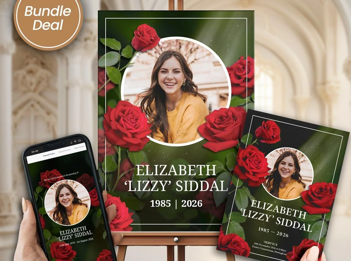
A funeral welcome sign is usually the first thing guests see as they arrive, which means it carries more weight than its size suggests.
Get the wording and design right, and it quietly sets the tone before anyone even reaches the door. Get it wrong too formal, too sparse, or placed as an afterthought and it can feel like the day started on the wrong note. Learning how to make a funeral welcome sign properly isn't complicated, but it does involve a few decisions that are easy to overlook when there's already so much else to plan.
We've helped families put these together many times, and one pattern comes up consistently: the signs that feel most fitting are rarely the most elaborate ones. They're simply the ones where the wording, photo, and layout were all considered together, rather than pieced together at the last minute.
Step One: Decide What the Sign Actually Needs to Say
Before thinking about design, it helps to settle the wording. Most funeral welcome signs include a fairly small amount of text, which means every word carries more weight than it would on a longer document.
A typical welcome sign includes:
The person's full name, sometimes with a nickname if that's how they were known
Their dates of birth and death, or occasionally just the year
A short phrase, a welcome, a line from a favourite saying, or a brief sentiment
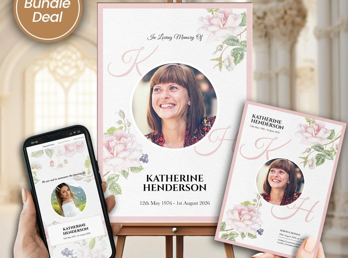
Sometimes a single line indicating the nature of the gathering, such as "In loving memory of or Please join us in celebrating the life of
It's worth resisting the urge to add too much here. A welcome sign isn't meant to carry the full story; that's what the order of service or eulogy is for. Its job is simply to greet guests warmly and confirm they're in the right place.
Step Two: Choose a Layout That Matches the Setting
Once the wording is settled, the next decision is how it will actually look and where it will sit. This matters more than people expect, since a sign designed for an easel at a church entrance needs a different layout than one meant to sit on a table at a smaller gathering.
Common layout considerations include:
Portrait orientation for freestanding easels, landscape for table displays
Font size large enough to read from a short distance, particularly for older guests
Whether the sign will include a photo, which affects how much space is left for text
Material choice: foam board, canvas, or framed print all suit different settings
If you're weighing up whether to include an image at all, our guide on whether a funeral welcome sign can include a photocovers that decision in more detail, including how it changes the overall layout.
A Quick Word From Membrance
Making a sign like this from scratch can feel surprisingly difficult when emotions are already high, mostly because there's pressure to get the wording exactly right on a document with very little room for error. This is one of the areas Membrance LLC spends real time supporting families with, not by writing the words for you, but by offering layouts that make the wording decisions easier to finalize. If it would help to see finished examples before starting your own, you're welcome to browse a range on the Membrance homepage.
Assembling the Sign Step by Step
With wording and layout decided, putting the sign together usually follows a fairly straightforward sequence:
Draft the wording first, ideally reviewed by a second family member before moving to design.
Choose a template or format that matches where the sign will be displayed.
Add a photo if you're including one, making sure it's high enough resolution for the intended print size.
Check spacing and font size at actual size, not just on screen, since text can look larger or smaller once printed.
Proof the final version carefully, particularly names, dates, and spelling.
Rushing step four is one of the most common reasons signs come back looking too cramped or oddly spaced once printed, so it's worth taking a little extra time here even under a tight deadline.
Common Mistakes When Making a Funeral Welcome Sign
A few issues come up repeatedly, regardless of how experienced the family is with design work:
Trying to fit too much text onto a small sign. This usually makes the whole design feel busy rather than welcoming.
Choosing a font that looks elegant but is hard to read from a distance. Decorative scripts can look lovely up close but become difficult to read across a room.
Skipping a proof at actual print size. What looks balanced on a laptop screen doesn't always translate the same way once printed at full size.
Forgetting to confirm the display method in advance. An easel-mounted sign needs different mounting or backing than one meant to lay flat on a table.
Not considering lighting at the venue. A sign with pale text on a light background can be difficult to read in dim indoor lighting.
Why This Matters More Than It Might Seem
It's easy to think of a welcome sign as a small, almost decorative detail compared to everything else involved in planning a service. In practice, it often plays a bigger emotional role than people expect, simply because it's the first personal touch guests encounter. Understanding why that first impression matters is worth exploring further; our guide on why funeral welcome signs are important goes into this in more depth, including how it shapes the tone guests carry into the rest of the service.
Choosing a Ready-Made Option Instead of Starting Blank
Not every family wants to design a sign from nothing, particularly with everything else that needs attention during this time. Starting from an existing format can remove much of the guesswork without making the final result feel impersonal.
Our Memorial Signs and Welcome Boards collection includes several ready-made layouts covering different sizes, orientations, and styles, so you can adjust wording and photos rather than building a design from scratch.
For families wanting something classic and easy to personalize, the Elegant Rose Welcome Sign is one of the most requested options; it pairs a clean, readable layout with soft floral detailing that suits both formal and more relaxed services.
Expert Perspective: Why Small Details Carry Real Weight Here
Because a welcome sign carries so little text, every choice on it is more visible than it would be on a longer document. A slightly awkward line break, an oddly sized font, or text that's too close to the edge of the page all stand out more on a sign than they would buried in a full booklet. This is exactly why experience with layout and spacing matters more here than the amount of content might suggest.
Cost is another area where families often want a clearer picture before committing to a design, particularly if they're comparing options across different sizes or materials. Our guide onhow much a funeral welcome sign costs breaks down what typically affects pricing, so budgeting doesn't have to be guesswork.
Bringing It All Together
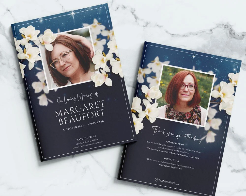
Making a funeral welcome sign comes down to a fairly simple sequence: settle the wording, choose a layout that fits the setting, assemble it carefully, and proof it at full size before printing. None of these steps are difficult individually, but skipping the order they usually happen in is where most last-minute stress tends to come from.
If you'd like help putting one together, feel free to contact us; we're happy to talk through wording or layout options for your service.
FAQs
1. What size is a typical funeral welcome sign?
Sizes vary, but a common range is around 18x24 inches for an easel display, with smaller tabletop versions often closer to 8x10 or 11x14 inches.
2. Can I use a nickname instead of a full name on the sign?
Yes, many families do, particularly if the nickname is how the person was widely known. It's a personal choice rather than a fixed rule.
3. Should the welcome sign match the order of service design?
It's not required, but many families prefer a coordinated look, since it creates a more cohesive impression across all the printed materials at the service.
4. What material is best for a funeral welcome sign?
This depends on the setting. Foam board is lightweight and affordable for indoor use, while framed prints or canvas tend to suit more formal or longer-lasting displays.
5. Can the sign be reused after the funeral, such as at a memorial event?
Yes, this is common, particularly for signs mounted on more durable materials like canvas or framed prints rather than lightweight foam board.